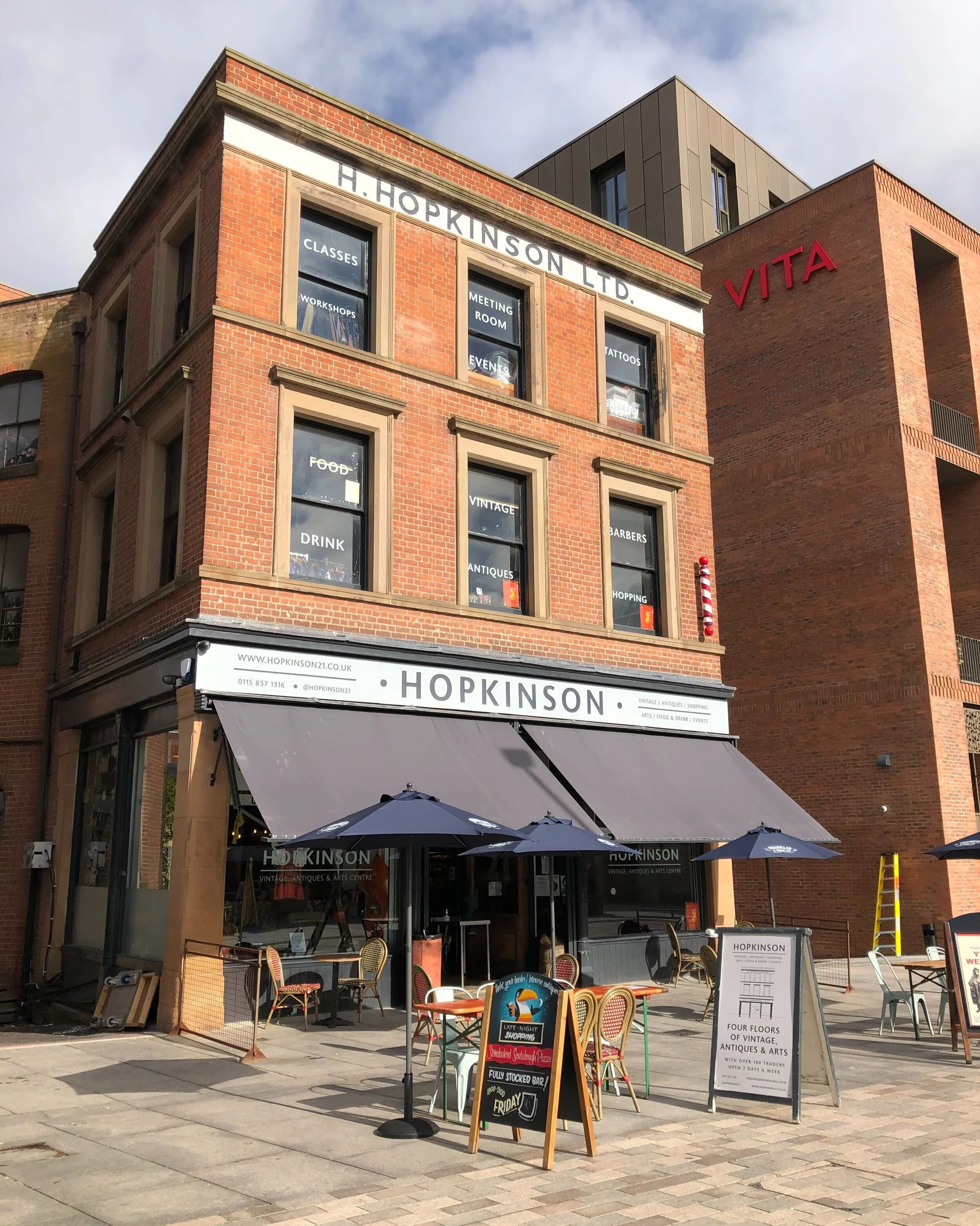
Canopies add to the character of the street scene and provide shelter from the sun and rain for customers.
At Barley Twist we can see many simple traditional details reinstated in 2017 including raked hand-painted sign, incorporated lighting, ventilation integral to the shopfront and security through laminated and toughened glazing and the use of branded blind to obscure the view into the shop when shut.
Recesses can be used to grade access from the pavement into the shop as seen at this shop reinstated in 2019; providing level access into buildings.
Bespoke security gates can be used to secure recessed parts of a shopfront without preventing views of features of a shopfront.
6. Technical quality
View the Details Gallery for more examples of technical details.
Signs
Signs are an opportunity for diversity and creativity however, extra care should be taken to maintain or enhance the character of historic buildings. A common detractor is the inappropriate use of large fascias and huge disproportionate signs. An appropriately proportioned fascia should result in signs that are designed in proportion with the shopfront and parent building. Whether signs are traditional or provide a modern contrast, it is important to understand and assess the colour palette and textures of the historic building and surrounding area prior to exploring design options. Consider the cumulative impact of the sign and any resulting clutter. Ideally historic signs should be restored as part of the design or carefully conserved behind new signs.
Lighting
Discrete external illumination may be possible, the intensity of illumination must not be excessive and the method of illumination should be carefully designed into the sign zone and without damage to the historic fabric.
Security
In many cases toughened and laminated glass over 10mm provides the security required by shop owners. Other discrete solutions include the use of, transoms, mullions, pilasters and stallrisers. Additional security options such as security gates or internally fitted security grilles may be considered on a case by case basis if strong justification is made. Ideally all security measures should maintain or enhance the historic shopfronts, not dominate them and should be carefully incorporated into the overall design. Extra care shall be applied to shutters on listed buildings and within conservation areas.
Canopies
Fabric canopies are a traditional feature and can be repaired, reused or reinstated where they have been lost. Canopy boxes should be recessed and integral to the shopfront design. Canopies provide shelter from the sun and rain for customers and add to the street scene therefore their use is encouraged.
Ventilation
Natural ventilation will reduce the need for mechanical ventilation, lowering energy consumption and costs. It can also add attractive detailing to shopfronts when traditional styles and materials are used. Traditionally different methods of ventilation worked together to create airflow, such as through windowhead ventilators, grills in stallriser, opening top lights and fanlights. Grills were plain or decorative and made of timber or metal.
Access
The often wider and deeper entrances of historic shopfronts improve access, providing more space and allowing for ramped entrances. Stallrisers and traditional decorative finishes to entrance floors increase legibility and kick plates protect the base of the door. A traditional-style light could be hung in the recess. All these features should be integral to the design and will add to the experience of shoppers and visitors, who will feel welcome and safe. Historic tiled entrances often survive and provide a distinctive and pleasing aspect to a shopfront. Well designed gates can prevent access to recessed doorways when the shop is closed.
Design Criteria
6.1 Retain and conserve historic details.
6.2 Proposed detail to relate to the palette of the historic building and its surroundings. If contrasting colours are used to increase legibility, these are in keeping with the site palette.
6.3 Proposed detail to relate to the textures of the historic building and its surroundings. If contrasting textures are proposed, the quality and ageing of materials has been considered.
6.4 Proposed intensity of any illumination must not be excessive and the method should be carefully designed into the sign zone.
6.5 Proposed designs should be in proportion and in character with the building and its time and place.
6.6 Proposed detail is of high quality and conceived as an integral part of the design.


