


The images above illustrate two site palettes in Nottingham. Designers need to consider that some colours are more temporary than others and can be susceptible to the seasons and weathering.
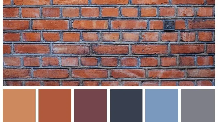
Example of a brick-bond colour palette.

This modern extension to the Victorian building picked only one of the shades from the historic bricks, which are perceived as a blend from the distance. The new terracotta cladding would have worked better in a contrasting colour, given that both textures are different.

In Trent Basin, these two colours of brick are too similar, making the massing appear as one. When two colours of brick are used, it is important to create a setback.

This image shows how the window reveals can have a significant impact on the façade texture. The building in the foreground has depth, which generates shadows. The building further away, in the same development, looks flat and has a far more homogeneous and dull façade.

This modern building has a fenestration arrangement that does not feel in keeping with Nottingham’s style. This is because the proportions and position of the windows in combination create a very regular façade texture, which does not follow Nottingham’s norm. Although openings have a rhythm and some hierarchy, the depth of the reveals and transoms do not work.
5. Palette & textures
Whether designs are expected to reflect or contrast with their context, it is important to understand and survey the colour palette in the surrounding area prior to exploring design options. Colour selection is very important because there is often an assumption that if colours are close in appearance they will go well together. If in doubt, designers and applicants are advised to refer to colour palettes broadly available on the internet. When colours are too close together in the spectrum, it is advisable to design in contrast with the dominant colours but conforming with the site palette.
Texture is often a difficult concept to grasp, particularly because it can be wrongly interpreted that it only refers to the material porosity. In reality, a small change in the grain of a façade material can have significant impact over time and through the seasons but it can also be very subtle. However, textures can be interpreted at various scales. The texture of a city can relate to the urban grain and massing in plan, or it can refer to the dominant pattern created by buildings, openings, vegetation and other landscape components. The texture of a streetscape can relate to the porosity of the building frontages, the amount, distribution and size of windows, openings and other perforations such as under-croft garages.
Design Criteria
5.1 The colours & textures of the proposal relate to the palette & textures of the site and its surroundings.
5.2 If contrasting colours are used to enhance the designs, these are in keeping with the site palette.
5.3 There is awareness and understanding of how proposed colours might impact on historic settings, listed buildings and local assets in the vicinity of the site.
5.4 If contrasting textures are used to enhance the designs, the effects at different times of the day and through the seasons have been illustrated, and the ageing of materials has been considered.
5.5 Fenestration depth respond to the Nottingham trend of deeper reveals that project shadows onto the framework and glazing.